Roblox UI Responsive Design Complete Guide: Offset, Scale, and UIScale Explained
Published June 4, 2026 · 8 min read
Introduction: Why Roblox Mobile UI Is So Hard
You spent hours building a perfect UI in Roblox Studio. The health bar sits exactly where you want it. The panel looks clean on your PC. You hit publish — and a player on their phone sends you a screenshot where the buttons are enormous and the layout has completely collapsed.
This happens for one simple reason: pixel-based sizing does not scale.
Roblox runs on hundreds of different screen resolutions — from a 4K monitor down to a small Android phone. If you size your UI in pixels (called Offset), it will look correct on exactly one resolution and broken on everything else.
In this guide you will learn:
- What
UDim2is and how Offset and Scale differ - Why Scale is almost always the right choice
- How to convert Offset values to Scale in seconds using the Roblox UI Scale Calculator
- What
UIScaleis, and why it is completely different from UDim2 Scale - How a single LocalScript makes your UI respond automatically to every device — no manual work required
Understanding Offset vs Scale in UDim2
Every UI element in Roblox — every Frame, TextLabel, ImageButton — has a Size and a Position property. Both use the UDim2 type:
UDim2.new(scaleX, offsetX, scaleY, offsetY)There are four numbers in two pairs — one pair for X, one for Y. Within each pair, Scale and Offset work very differently.
Offset: Fixed Pixels
Offset is a raw pixel count. Setting a frame to:
frame.Size = UDim2.new(0, 200, 0, 100)...makes it exactly 200 × 100 pixels on every device.
The problem is immediately visible. Here is that exact frame on an iPhone XR (896 × 414):
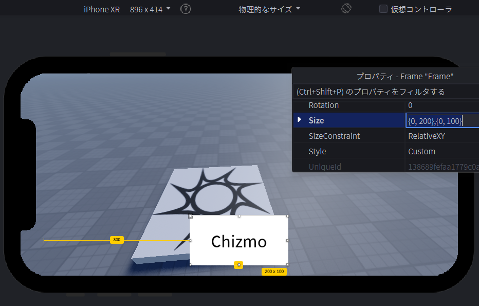
The frame is not “broken” — it is exactly 200 × 100 pixels, just as instructed. The problem is that 200px on a 414px-wide phone is enormous. Offset does not adapt; it just overflows.
Scale: Relative Ratio
Scale expresses size as a fraction of the parent container. A value of 1.0 means 100% of the parent; 0.5 means 50%; 0.104 means about 10.4%.
frame.Size = UDim2.new(0.104, 0, 0.093, 0)On a 1920 × 1080 screen: 0.104 × 1920 = 200px. On an iPhone XR: 0.104 × 896 = 93px. The element scales proportionally — and here is the result on the same iPhone XR:
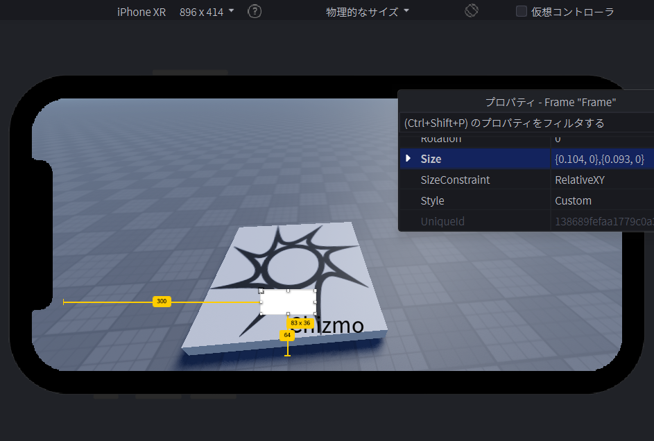
The layout stays intact on every device without any extra code.
The rule: Use Scale for everything. The only exception is elements that genuinely need a fixed pixel size, such as a 1px border line.
How to Convert Offset to Scale Using the UI Scale Calculator
Doing the math by hand is tedious and error-prone. The Roblox UI Scale Calculator handles it instantly.
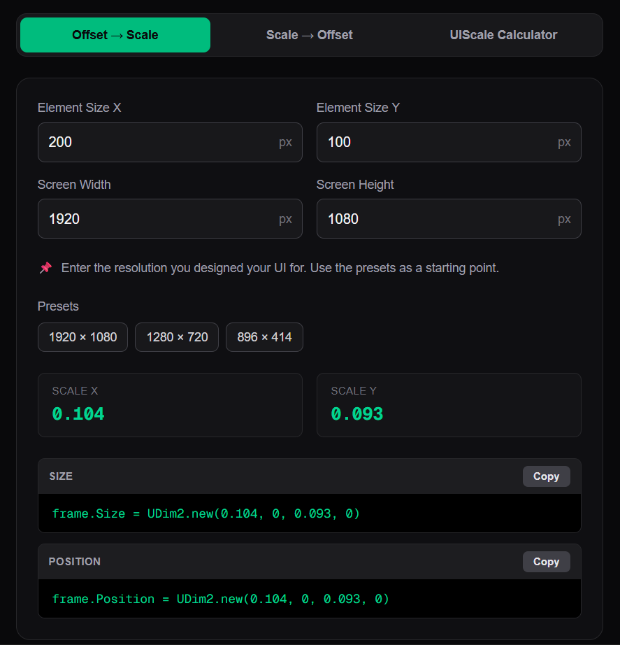
Step-by-step example: converting a 200 × 100 px Frame
- Open the UI Scale Calculator and select the Offset → Scale tab.
- Enter your element size: Width
200, Height100. - Enter your base resolution — the resolution you designed your UI for. If you work on a 1080p monitor, enter
1920×1080. Use one of the presets for common resolutions. - Copy the generated code:
frame.Size = UDim2.new(0.104, 0, 0.093, 0)Paste it into Roblox Studio’s Properties panel or directly into a script.
Note on the calculator presets vs. your test device: The presets (1920 × 1080, 1280 × 720, etc.) represent the resolution you designed for— your base. The device you test on in Roblox Studio’s Device Emulator (such as iPhone XR at 896 × 414) is a separate concept. You do not need your test device’s resolution in the calculator — just your design base.
Limitations of UDim2 Scale Alone
Scale solves most responsive problems, but has three important limitations.
1. TextSize is not affected. The TextSize property on TextLabel and TextButton is always in pixels — there is no Scale equivalent built in. A TextSize of 24 will render too large on a small phone screen even if the surrounding frame is perfectly scaled. You need UIScale (covered next) to solve this.
2. Scale does not preserve shape. Because Scale X and Scale Y are each a ratio of their respective axis, a “square” frame will look different depending on the screen’s aspect ratio. For example, UDim2.new(0.2, 0, 0.2, 0) gives you 20% of the width and 20% of the height — which are different pixel values on a widescreen monitor vs. a phone held in portrait.
For cases where you need a fixed shape, use the dedicated Roblox Instances designed for that purpose:
- Keep a square a square →
UISizeConstraint(set MinSize and MaxSize to the same value) - Lock an aspect ratio →
UIAspectRatioConstraint
Scale is best used for layout and placement — specifying where something sits and how large it is relative to the screen. Shape preservation is a separate responsibility handled by constraint Instances.
3. Converting large projects takes time. If you have dozens of UI elements all using Offset, converting each one is slow work. The calculator speeds this up significantly, but the need to check every element is still real.
Introducing UIScale: One Script, Every Device
UIScale directly addresses the first of these limitations — and it works completely differently from UDim2 Scale.
UIScale is not a property. It is an Instance (an object) that you insert into a ScreenGui or Frame. Once inserted, it applies a single multiplier to the visual size of everything inside that container — including text.
Think of it as a zoom lens: a UIScale.Scale of 0.5 shrinks the entire UI to 50%. Here is the same frame from earlier with a UIScale of 0.5 applied to the ScreenGui:
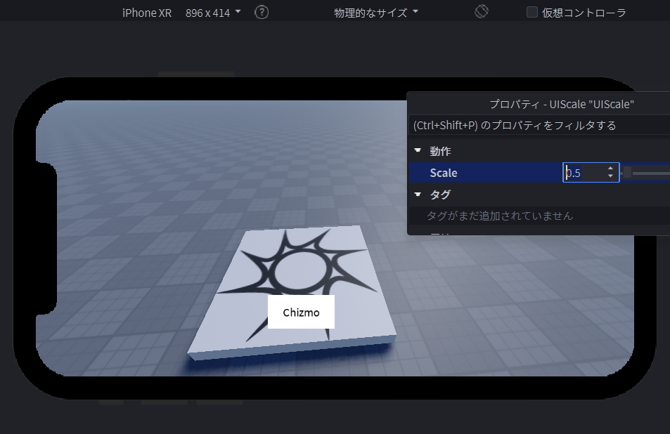
How to Add UIScale in Roblox Studio
1. In the Explorer, right-click your ScreenGui
2. Select Insert Object → UIScale
3. In Properties, set the Scale value
Why a Fixed UIScale Value Is Not Enough
Setting UIScale.Scale = 0.5manually has the same problem as Offset — it only looks right on one specific screen size. What you really need is for the Scale value to change automatically depending on the player’s actual device.
That is where the script comes in.
The Complete Solution: One Script for Every Device
The UI Scale Calculator generates this script automatically on the UIScale Calculator tab:
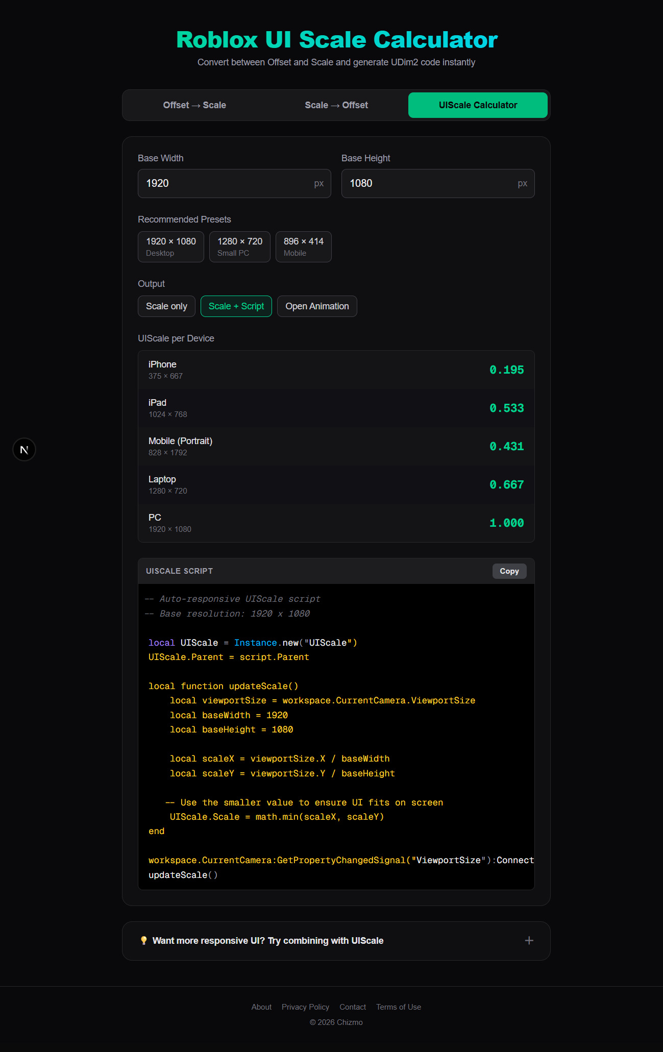
-- Auto-responsive UIScale script
-- Base resolution: 1920 x 1080

local UIScale = Instance.new("UIScale")
UIScale.Parent = script.Parent

local function updateScale()
    local viewportSize = workspace.CurrentCamera.ViewportSize
    local baseWidth = 1920
    local baseHeight = 1080

    local scaleX = viewportSize.X / baseWidth
    local scaleY = viewportSize.Y / baseHeight

    -- Use the smaller value to ensure UI fits on screen
    UIScale.Scale = math.min(scaleX, scaleY)
end

workspace.CurrentCamera:GetPropertyChangedSignal("ViewportSize"):Connect(updateScale)
updateScale()
Copy this script, paste it into a LocalScript inside your ScreenGui, and you are done. It handles every device automatically.
How It Works
The only value you need to change is the base resolution — set baseWidth and baseHeight to the resolution you designed your UI for. If you worked on a 1080p monitor, leave them as 1920 and 1080.
At runtime, the script reads the player’s actual screen size and calculates the ratio:
| Device | Viewport | scaleX | scaleY | Final UIScale |
|---|---|---|---|---|
| 4K Monitor | 3840 × 2160 | 2.0 | 2.0 | 2.0 |
| 1080p PC | 1920 × 1080 | 1.0 | 1.0 | 1.0 |
| iPad | 1024 × 768 | 0.53 | 0.71 | 0.53 |
| iPhone XR | 896 × 414 | 0.47 | 0.38 | 0.38 |
The math.min picks the smaller of the two ratios — this guarantees the UI always fits on screen without overflowing on either axis. The GetPropertyChangedSignal line means the scale also updates automatically if the player resizes their window mid-session.
No manual work. No per-device adjustments. One script covers everything.
Best Practices
Responsive Design Checklist
- All
SizeandPositionvalues use Scale, not Offset - A UIScale Instance is present inside each ScreenGui
- The auto-responsive LocalScript (from the UIScale tab) is attached to each ScreenGui
baseWidthandbaseHeightin the script match your design resolution- Tested in the Device Emulator on at least: 1920 × 1080, 1280 × 720, and a phone preset
Common Mistakes
Entering the wrong resolution in the calculator. The Screen Width and Screen Height fields expect your design resolution — the screen you used in Roblox Studio. Do not enter the player’s device resolution; Roblox handles that automatically via Scale.
Mixing Offset and Scale without a plan. A value like UDim2.new(0.5, 50, 0, 30) combines Scale and Offset — the Offset part does not adapt and will cause inconsistent sizing. Pick one and be consistent.
Hardcoding UIScale to a fixed value. Setting UIScale.Scale = 0.7 without the script is only correct for one resolution. Always drive UIScale from the actual viewport.
Testing only on PC. The Device Emulator in Roblox Studio is free and fast. Check every UI change on at least one phone preset before publishing.
Deep nesting. UDim2 Scale is relative to the parent element, not the screen. Deeply nested Frames create confusing size chains. Keep your UI hierarchy as flat as practical.
Conclusion
Responsive Roblox UI comes down to three things working together:
1. UDim2 Scale for every element’s Size and Position, so the layout always adapts to its container.
2. UI Scale Calculator to convert any existing Offset values to Scale in seconds, with ready-to-paste UDim2 code — no manual math required.
3. The UIScale LocalScript from the UIScale Calculator tab — paste it once into your ScreenGui and every device is handled automatically, forever.
Once these three are in place, your UI works on a 4K monitor, a school laptop, and an iPhone without touching a single element per device.
Also useful: Roblox Tween Generator — generate TweenService Lua code for smooth UI animations.
Tags: Roblox UI responsive design · Roblox UDim2 tutorial · Roblox mobile UI · Roblox UIScale · Offset Scale conversion